Moomin day – Tove Jansson and Finnish Art

So, today is August 9th, also known as the Moomin Day. Today we celebrate one of our most beloved Finnish artist Tove Jansson and her Moomin books. We also celebrate Finnish Art.

August 9th is actually Tove Jansson’s birthday. She was born 9.8.1914 in Helsinki and died 27.6.2001 in Helsinki. She was a writer, painter and and illustrator, who made the famous original Moomin books. Muumit (that’s what we call these quirky characters in Finland) are an inseparable part of the childhood on many Finns, including myself. There were also Moomin animations on TV and Moomin comics on newspapers. Growing up I always read the Moomin comics on local newspaper. They were the original black and white comics and in my opinion the best character was without a doubt Haisuli (Stinky). Nowadays, the Moomin are still very popular in Finland and almost every home has some kind of Moomin-related item. We have one Moomin-mug and the adventuring character on the mug is – of course – lovely Haisuli.

I have always loved children’s books illustrations. I adored as a child Jill Barklem’s Brambly Hedge-series. All those details and the color choices were just sublime, so she gets a special mention in this post even though she is not Finnish. I was a member in a Finnish children’s book club as a child (cannot remember the clubs name….) and some of those books are basically etched into the retinas of my eyes. The ultimate number 1 was Leena ErkkilĂ€’s book Kuottarulla (1974, WSOY). I was beautifully made, almost like graphic art print. Vibrant colors and really good use of black. The heroine of the story was a girl called Kuottarulla, who solved everybody’s problems. Sadly I don’t have the book anymore, it got really damaged from all the reading and just fell apart.

Entering motherhood took me yet on another trip through children’s books illustrations, but this time on a rather boyish trip. We read authors like Mauri Kunnas and Aino Havukainen and Sami Toivonen. Mauri Kunnas is probably best known for his Santa Claus-book. We as a family loved his Joulupukki ja noitarumpu-movie (Santa Claus and the magic drum, 1996). Also his book Hullunkurinen lintukirja is a treasure (Gummerus 2008, it’s about birds, but in a comically way). But I cannot write about Finnish children’s literature without bringing up Tatu and Patu-bookseries, created by Aino Havukainen and Sami Toivonen. These books are undeniably the most hilarious books of all time, and the illustrations are amazing. We always read the latest Tatu and Patu-book even though our son is already a teenager.

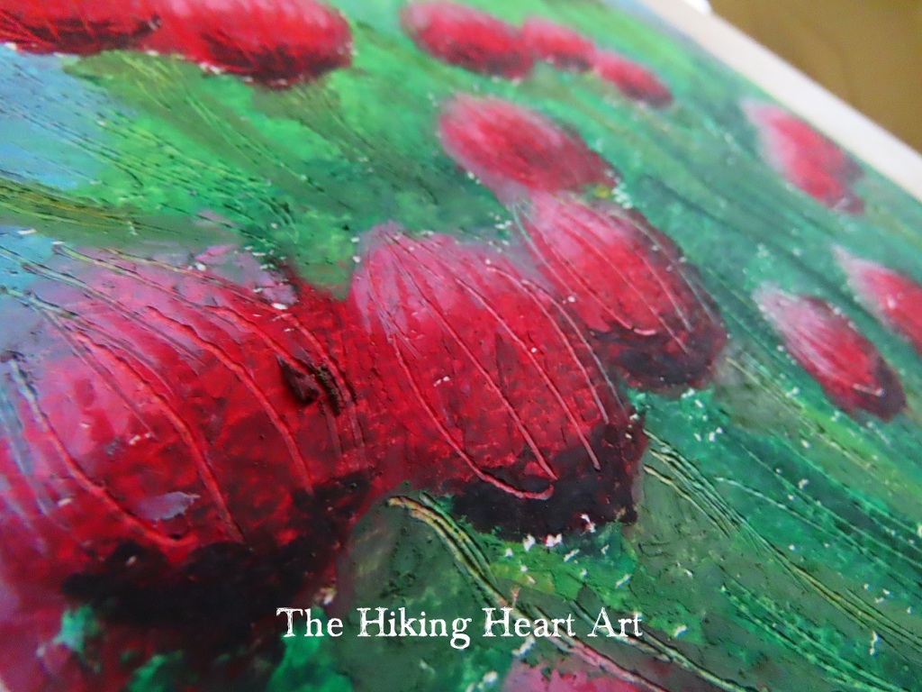
I have toyed with the idea of making a children’s book myself, but I think now is not the right time. Some of my paintings do have that kind of illustrative elements, so maybe some day I’ll make one of my own. The painting at the top of this post is one of those that have that “bookish vibe”. I often check my color values on a blank watercolor paper when I paint. Sometimes these marks that I make evolve into another painting and this “Peter’s Island Adventure” is one of them. So there were only different size color spots on the paper and with some more watercolor and markers I painted what I saw in those spots. Up came my son Peter and his adventures on “our” island. I think this method is one of the most enjoyable and I really recommend to try it.

Imaginary flowers

I have a confession to make: I love pastels! I love how they make your fingers all mucky, how they move on paper, the crumbs that fall everywhere. They can also be very tricky medium (alongside watercolors) and the end result may surprise not just the audience but also the artist 😀 Pastels capture my imagination.

It was clear and bit windy May Day when I sat down in my garden and started to draw this painting “Spring in my mind” from imagination. I used SMLT Art’s 240 g cold-pressed watercolor paper and Derwent’s pencils. The pastels I used were Pentel and Royal Talens van Gogh oilpastels. First the flowers that I sketched reminded me of clovers, but then the shape shifted towards tulips. My art often ends up having a surrealistic element, so this time the shapeshifting flowers found their way to the paper.

The paper I chose was white, but I wish I would’ve used a colored one. Bluish gray might have worked nicely. But then again, the choice of using white paper made me improvise at the end and I learned a new technique how to save a painting that is about to go sideways.

But first things first. After sketching I started to put some pastels layers on the stems and grass. I used lighter colors on the underlayers so that I could remove the top layer with something sharp so the lighter colors would make the lines visible. This can also be done the other way around. The technique is called sgraffito.

I used an old knitting needle to make the lines. It was thin enough but not so heavy on the paper that the fibers on the paper would stick out. This worked well on green areas, but I was having problems with the blue. I wanted to make floating “bubbles” coming from the flowers, and it just did not work on the blue background. The white paper did not come through as much as I had hoped, so I had to use blue colored pencil to make the bubbles stand out from the sky. The pencil had to be really sharp that it didn’t flatten the sgraffito lines that I had already made. It took some work because the oilpastel was already on the paper, but adding some kingfisher blue did the trick. That was the only colored pencil that I used.

The color palette that I chose was on the cool side, I guess the may weather affected my mood. Pentel hasn’t named their oilpastels, but Royal Talens has. On the flowers I used colors like deep rose, red violet and carmine with some black. I made the grass and the stems with dark viridian (my favorite green) and permanent green light + medium with hints of black. I absolutely love yellow ochra, so I added it to the stems to give some structure and shade and also to tone down the cooler colors. The sky was really crisp and windy that day, so I painted the sky celrulean (phthalo) blue with some light and deep turquoise.

I did not use a lot of time working on this painting, I just wanted to capture that day and that moment. I also wanted to keep it simple and light, and not overthink it. Painting this made me feel serene, I hope the painting can convey this emotion. And I’m definitely going to do some more sgraffito paintings, there aren’t many art related things more satisfying than watching oilpastel crumble off the paper (ASMR).

My new poetry collection book is now available!

Joesta syntynyt sisÀltÀÀ 4 suomen- ja englanninkielistÀ runokokoelmaa rakkaudesta, luonnosta, elÀmÀstÀ ja autismista. Luonnon ja ihmisen vuorovaikutus ja ympÀristön merkitys, kestÀvÀ rakkaus ja pitkÀaikainen kumppanuus, ihmissuhteet ja henkinen vÀkivalta, kirjoittajan oma tavoite aitoon muutokseen elÀmÀssÀÀn, erityisvanhemmaksi tulo ja siihen rooliin kasvaminen ovat tÀmÀn syvÀltÀ luotaavan kirjan aiheita.

Born from the River contains 4 poem collections in finnish and in english about love, nature, life and autism. Nature’s and human’s interaction and the meaning of the environment, long lasting love and companionship, relationships and mental abuse, author’s own quest for true change in her life, becoming a special needs parent and also growing into the role of an autism parent are the subjects of this profoundly written book.

Here are some links where you can purchise e-book and/or printed version:

Books On Demand (e-book version with original layout)

Google Play

Amazon (for Kindle)

Suomalainen Kirjakauppa

Bokus (Sweden)

Ellibs

Decitre (France)

PocketBook (Deutschland)

Storytel

When the book is converted to e-book, it can loose it’s original layout. You can buy the original version from BoD-bookshop (link above) that has the layout as I designed it.

I hope You enjoy the reading!

Sketching exercise

I found a really interesting book in the local library, a sketching guide with almost 200 pages of exercises. The Finnish name is called “NĂ€in piirrĂ€t maisemia ja muita aiheita” (Kustannus-MĂ€kelĂ€ 2018). The English name wasn’t included in the printing info page, but the original publisher was Walter Foster Publishing, Inc. The translation could probably go like this: How to draw landscapes and other nature themes.

I was immediately drawn to a fallen tree sketch exercise. For paper I opted Canson acid free 70 g sketching paper, that is lightly grained and rigid. For pencils I chose Derwent Academy Sketching pencils.

Fallen tree 1: basic shapes and composition.

Fallen tree 2: Tree trunk begins to form, more added details.

Fallen tree 3: Almost finished!

The book contains more really good basic exercises, for example how to draw animal textures, depth and distance in landscapes, how to draw clouds etc. I’ll probably draw and post more sketches from this book later.

Welcome to my art journey!

Yesterday was spring equinox, so the day is becoming longer than the night. Good time to start something new, I think. So here we go!

Art has always been really important to me. I have studied it as an secondary subject and I have taken multiple art courses on my free time. I have also studied art from books and various other medias on my own. The results of all that will be displayed here on my blog.

I also have passion for photography. Often , when I go on a walk or otherwise spend time outside, I can see photographs in the landscape. I can see how I would crop the image, what angle would I take the photo, what would be the camera setting and so on. I love to look at different textures and find something hidden in plain sight. I will publish at some point my art photographs also here on the blog.

Anyway, let’s get blogging!

Anne