
I have a confession to make: I love pastels! I love how they make your fingers all mucky, how they move on paper, the crumbs that fall everywhere. They can also be very tricky medium (alongside watercolors) and the end result may surprise not just the audience but also the artist 😀 Pastels capture my imagination.
It was clear and bit windy May Day when I sat down in my garden and started to draw this painting “Spring in my mind” from imagination. I used SMLT Art’s 240 g cold-pressed watercolor paper and Derwent’s pencils. The pastels I used were Pentel and Royal Talens van Gogh oilpastels. First the flowers that I sketched reminded me of clovers, but then the shape shifted towards tulips. My art often ends up having a surrealistic element, so this time the shapeshifting flowers found their way to the paper.
The paper I chose was white, but I wish I would’ve used a colored one. Bluish gray might have worked nicely. But then again, the choice of using white paper made me improvise at the end and I learned a new technique how to save a painting that is about to go sideways.
But first things first. After sketching I started to put some pastels layers on the stems and grass. I used lighter colors on the underlayers so that I could remove the top layer with something sharp so the lighter colors would make the lines visible. This can also be done the other way around. The technique is called sgraffito.
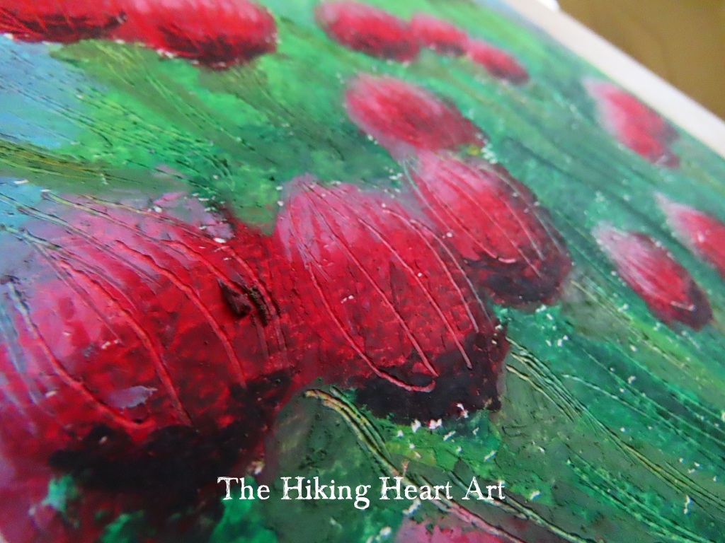
I used an old knitting needle to make the lines. It was thin enough but not so heavy on the paper that the fibers on the paper would stick out. This worked well on green areas, but I was having problems with the blue. I wanted to make floating “bubbles” coming from the flowers, and it just did not work on the blue background. The white paper did not come through as much as I had hoped, so I had to use blue colored pencil to make the bubbles stand out from the sky. The pencil had to be really sharp that it didn’t flatten the sgraffito lines that I had already made. It took some work because the oilpastel was already on the paper, but adding some kingfisher blue did the trick. That was the only colored pencil that I used.
The color palette that I chose was on the cool side, I guess the may weather affected my mood. Pentel hasn’t named their oilpastels, but Royal Talens has. On the flowers I used colors like deep rose, red violet and carmine with some black. I made the grass and the stems with dark viridian (my favorite green) and permanent green light + medium with hints of black. I absolutely love yellow ochra, so I added it to the stems to give some structure and shade and also to tone down the cooler colors. The sky was really crisp and windy that day, so I painted the sky celrulean (phthalo) blue with some light and deep turquoise.
I did not use a lot of time working on this painting, I just wanted to capture that day and that moment. I also wanted to keep it simple and light, and not overthink it. Painting this made me feel serene, I hope the painting can convey this emotion. And I’m definitely going to do some more sgraffito paintings, there aren’t many art related things more satisfying than watching oilpastel crumble off the paper (ASMR).
